
Für Aureon Real Estate wurde eine ganzheitliche Brand Identity entwickelt, die strategische Klarheit mit einer zeitlosen, hochwertigen visuellen Sprache verbindet. Ziel war es, eine Marke zu schaffen, die Vertrauen aufbaut, Qualität vermittelt und über alle Kanäle hinweg konsistent funktioniert.
Vorgehensweise
Der Prozess beginnt nicht mit Design, sondern mit Struktur.
In einem ersten Schritt wurden die Markenwerte, die Positionierung und der gewünschte Charakter definiert. Diese strategische Basis bildet das Fundament für alle gestalterischen Entscheidungen.
In einem ersten Schritt wurden die Markenwerte, die Positionierung und der gewünschte Charakter definiert. Diese strategische Basis bildet das Fundament für alle gestalterischen Entscheidungen.
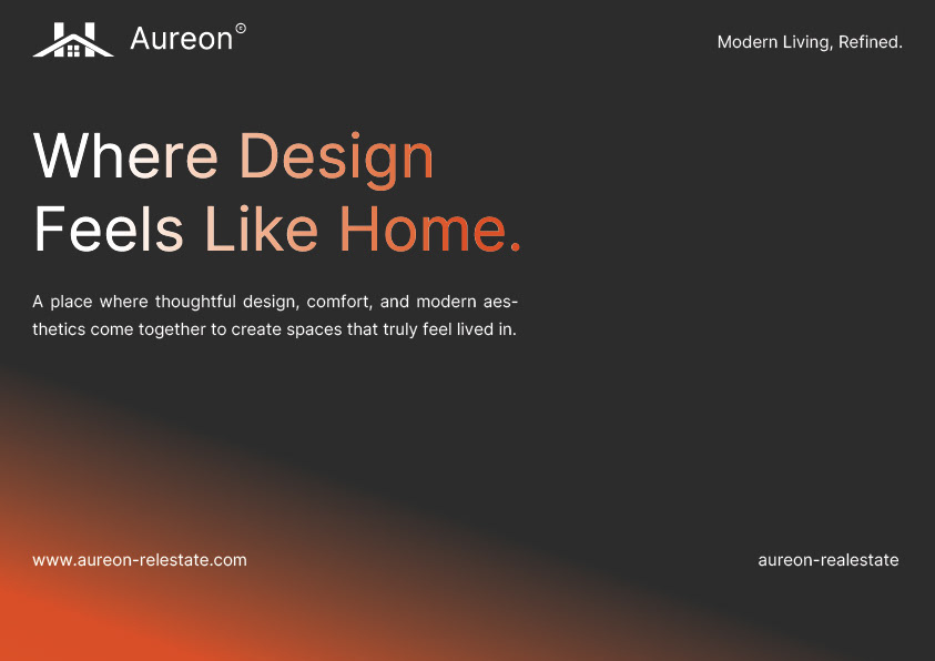
Darauf aufbauend entstand ein visuelles System, bestehend aus:
- einem klaren, reduzierten Logo-System
- einer abgestimmten Typografie-Hierarchie
- einer warmen, hochwertigen Farbwelt
- einer einheitlichen Bildsprache sowie grafischen Elementen und Icons
Alle Bestandteile wurden in einer Brand Identity Guideline zusammengeführt, die nicht nur Gestaltung zeigt, sondern klare Regeln für die Anwendung definiert – von Digital über Print bis hin zu Social Media und Wearables.
Mehrwert für Kunden
Durch diesen strukturierten Ansatz entsteht keine einzelne Gestaltung, sondern ein skalierbares Markensystem.
Kunden profitieren davon, weil:
Kunden profitieren davon, weil:
ihre Marke überall gleich wirkt – unabhängig vom Medium
Entscheidungen schneller getroffen werden können
neue Designs jederzeit konsistent weiterentwickelt werden können
Vertrauen und Wiedererkennbarkeit nachhaltig gestärkt werden
Die Brand Guideline dient dabei als zentrales Werkzeug – intern für Teams und extern für Partner, Agenturen oder Dienstleister.
Ergebnis
Das Ergebnis ist eine moderne, elegante Markenidentität, die langfristig funktioniert und Raum für Wachstum lässt.
Aureon Real Estate zeigt, wie durch klare Prozesse und durchdachtes Design eine Marke entsteht, die nicht nur gut aussieht, sondern strategisch trägt.
Aureon Real Estate zeigt, wie durch klare Prozesse und durchdachtes Design eine Marke entsteht, die nicht nur gut aussieht, sondern strategisch trägt.
Du möchtest ebenfalls eine Marke, die klar positioniert ist und langfristig funktioniert?
Dann lass uns gemeinsam eine Brand IdentMehr Informationenity entwickeln, die mehr ist als nur Design.
Dann lass uns gemeinsam eine Brand IdentMehr Informationenity entwickeln, die mehr ist als nur Design.